There are 7 types of infographics: statistical, informational, timeline, process, geographic, comparison, and hierarchical. Infographics are visual representations of data and information that make complex concepts easier to understand.
They are a popular tool for presenting information in a visually engaging and accessible format. Infographics are a versatile and powerful tool for communicating information effectively. From displaying statistical data to explaining complex processes, infographics can convey information in a visually compelling manner.
In today’s digital age, where attention spans are short, infographics can grab and hold the audience’s attention more effectively than plain text. This guide will provide an overview of the 7 types of infographics, their characteristics, and how they can be used to enhance communication and engage audiences. Whether you are a marketer, educator, or content creator, understanding the different types of infographics can help you create impactful visual content that resonates with your audience.
What Are Infographics?
Infographics are visual representations of information, data, or knowledge. Their purpose is to present complex information quickly and clearly. Through the use of images, charts, and minimal text, they can simplify and explain intricate concepts. These visual aids can increase engagement, comprehension, and retention in readers. They are especially effective when trying to convey statistics, survey results, timelines, and processes. Infographics can come in various forms, including statistical, informational, timeline, process, geographic, comparison, and hierarchical infographics. Each type serves to highlight different types of information in a visually appealing and easy-to-understand manner.
The Importance Of Infographics
Infographics play a vital role in conveying complex information visually. There are seven main types of infographics: statistical, informational, timeline, process, comparison, geographic, and hierarchical. Each type serves a specific purpose, helping readers understand and retain the presented data more effectively.
| Infographic Type | Definition |
| Informational | Presenting facts and data in a visually appealing manner. |
| Timeline | Displaying historical events in a chronological order. |
| Statistical | Showcasing statistical data and comparisons through visuals. |
| Process | Explaining a step-by-step process or guide visually. |
| Hierarchical | Illustrating hierarchy or structure of information. |
| Geographical | Visualizing geographic data or connections between locations. |
| Comparison | Comparing different sets of data or elements in a visual format. |
Infographics play a crucial role in communication by presenting complex information in a simplified and engaging way. They enhance engagement and aid in better retaining and comprehending essential information. These visual tools are categorized into seven types, each serving a unique purpose. Informational infographics impart factual content, while timeline infographics depict historical events chronologically. Statistical infographics present data comparisons, and process infographics provide step-by-step guidance visually. Hierarchical infographics illustrate information structures, whereas geographical infographics visualize geographic data or connections. Lastly, comparison infographics facilitate visual comparison of different data sets or elements. Each type offers a distinct way to present information effectively and attract engagement.
Statistical Infographics
Statistical Infographics: Infographics are graphic visual representations of information, data, or knowledge intended to present information quickly and clearly. They can improve cognition by utilizing graphics to enhance the human visual system’s ability to see patterns and trends.
Definition: Statistical infographics are a type of infographic that represents data in a visual format, making complex information easy to grasp at a glance.
Usage: Statistical infographics are widely used in reports, presentations, and websites to communicate statistical information effectively.
Design Tips: When creating statistical infographics, it is essential to use clear and concise visual elements, such as charts and graphs, to effectively communicate the data.
Informational Infographics
Sure, I can help with that. Here is the content in HTML format:
“`html
Informational Infographics: Infographics are visual representations of data designed to make complex information easily understandable. They can be used to communicate a message, present data, or explain a concept. Application: Informational infographics are commonly used in reports, presentations, and social media posts to convey information in a visually appealing way. They are also utilized in educational settings to aid in understanding complex topics. Design Tips: When creating informational infographics, it’s important to focus on simplicity and clarity. Use a cohesive color scheme, clear fonts, and data visualization techniques to effectively convey the information.
Timeline Infographics
Timeline infographics are a visual representation of chronological events, presenting information in a sequential order.
The purpose of timeline infographics is to convey a series of events in a clear and engaging manner, making it easier for the audience to grasp the timeline of a particular subject.
- Utilize a linear layout to visually depict the sequence of events
- Use vibrant colors and imagery to captivate audience attention
- Incorporate concise text to accompany each event
- Consider adding icons to represent different milestones
Process Infographics
Process infographics are a visual representation of a sequence of steps or actions. They can be used to illustrate a process, workflow, or a series of events in a clear and easy-to-understand manner. These types of infographics are commonly utilized in various industries such as healthcare, manufacturing, and education. When creating process infographics, it is essential to focus on creating a logical flow and using clear, descriptive icons or images to represent each step.
One of the key design tips for process infographics is to use a consistent color scheme and layout to maintain visual coherence. Additionally, it is important to keep the text concise and use bold headings to highlight each step. When applying process infographics, consider using them in instructional materials, manuals, or presentations to effectively convey complex procedures or workflows.
Geographic Infographics
Geographic infographics are visual representations of data and information related to geographic locations. These infographics are commonly used to showcase statistics, demographic data, and other geographic-related information in a visually engaging manner. They are often utilized in presentations, reports, and educational materials to provide a clear and intuitive overview of geographic data.
Geographic infographics can be utilized in a variety of ways, such as illustrating regional population distributions, displaying sales or market trends across different locations, and showcasing environmental or topographic data. Due to their visual nature, they can effectively communicate complex geographic information in a simplified and easily digestible format.
When designing geographic infographics, it’s essential to carefully consider the visual elements, including map projections, color schemes, and appropriate labels. Consistency in design and the use of easily understandable symbols and icons can enhance the overall effectiveness of the infographic and ensure that the geographic data is communicated clearly to the audience.
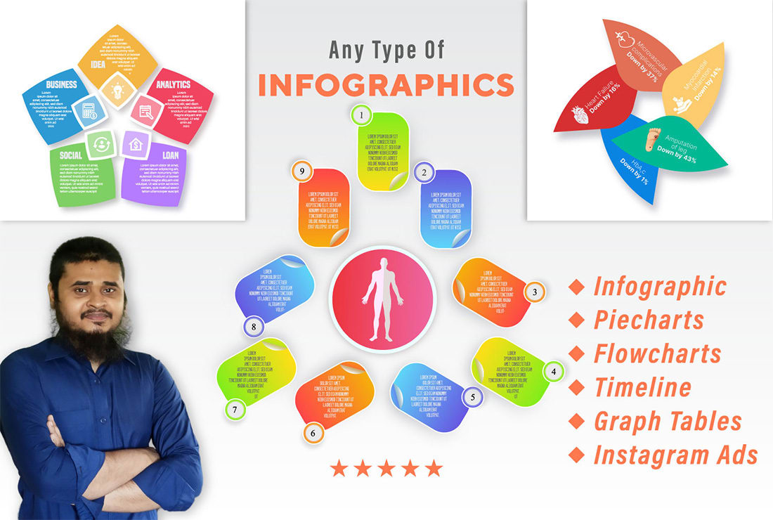
Credit: www.fiverr.com
Comparison Infographics
Comparison Infographics are a visual representation of data to highlight differences or similarities between multiple items. They are effective in presenting information and statistics in a visually appealing manner. These infographics can be used to compare products, services, or concepts. When creating a comparison infographic, focus on clear and concise visuals and use easily understandable graphs or charts. Avoid clutter and ensure that the design is visually engaging and organized. Consider using contrasting colors to differentiate between the compared items. When it comes to usage, comparison infographics are commonly employed in marketing, research studies, and educational materials. They are ideal for presenting complex data in a simple and understandable format. When designing a comparison infographic, prioritize a clear and straightforward layout, utilizing visual elements such as icons, labels, and captions to enhance comprehension. Ensure that the infographic aligns with the intended purpose and effectively conveys the compared information.
Hierarchical Infographics
Hierarchical Infographics
Hierarchical infographics are visual representations that showcase data in a structured and organized manner. These infographics are designed to illustrate the hierarchy, relationships, and flow of information in a clear and understandable way. The primary purpose of hierarchical infographics is to simplify complex information and make it easier for the audience to comprehend. When creating hierarchical infographics, it is essential to keep the design clean and straightforward. Use clear visual cues such as arrows, lines, or connective elements to indicate the hierarchical structure. Consistent color-coding and spacing can also enhance the overall readability of the infographic.
Frequently Asked Questions Of What Are The 7 Types Of Infographics
What Are The Benefits Of Using Infographics?
Infographics condense complex information into visual form, making it easier to understand and remember. They also increase engagement and enhance brand recognition through visual storytelling.
How Do Infographics Improve Seo?
Infographics attract backlinks, driving traffic and improving search rankings. They also increase content shareability and engagement, signaling quality to search engines and boosting SEO performance.
What Are The Key Elements Of An Effective Infographic?
An effective infographic includes a compelling title, engaging visuals, clear data representation, and a cohesive narrative. It seamlessly blends creativity with information to communicate a message effectively.
Conclusion
Infographics are valuable tools for presenting information in a visually engaging manner. Understanding the various types of infographics, such as statistical and process-based, empowers content creators to effectively communicate complex data. By selecting the most suitable format for their message, they can capture and retain the interest of their audience.
Incorporating infographics into their content can elevate the impact and engagement of their materials.